04 — Product Cards
One Product Story Everywhere
Shoppers now see the same polished product presentation on the homepage, category pages, brand pages, search results, and campaign blocks.
7
separate card styles before
1
shared card used everywhere now
20+
design rules keeping it consistent
4-col
clean desktop grid layout
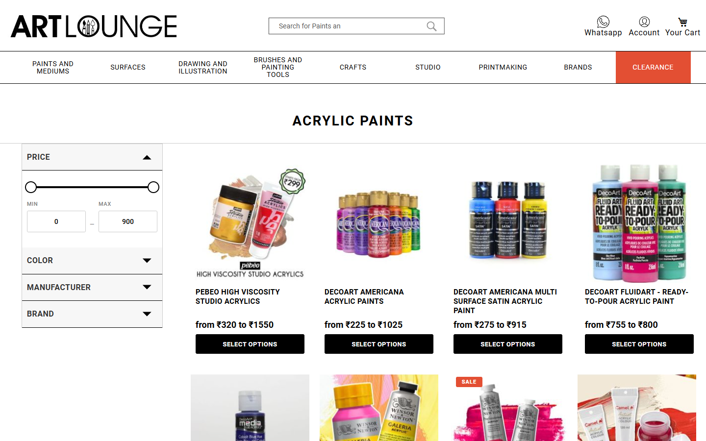
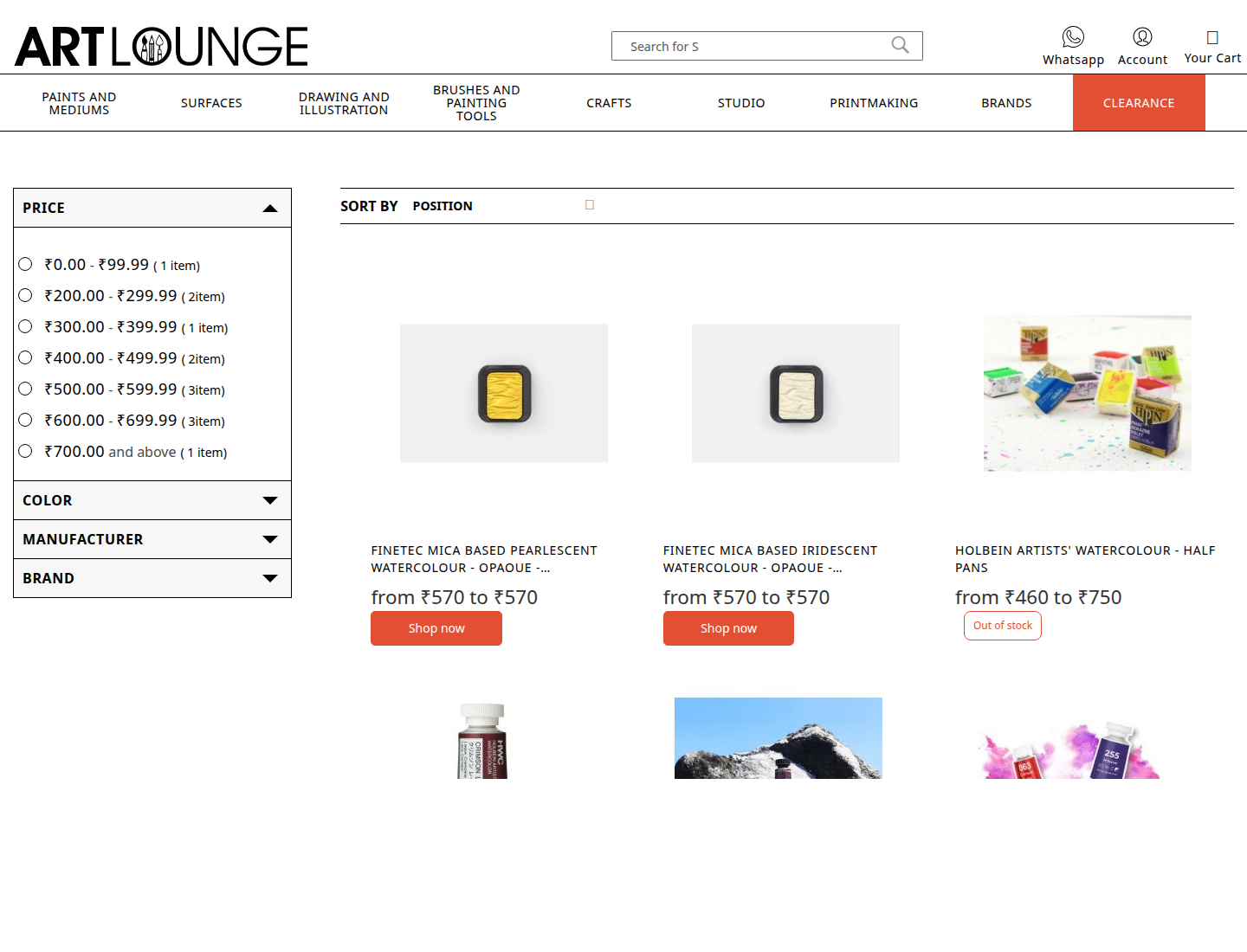
See the problem — then see it solved
There were 7 separate card implementations across the site. Click “Merge into one” to see what consolidation looks like.
7 different card styles — one per context
Each page had its own card implementation. Different buttons, fonts, and spacing everywhere.
Homepage
Product Name
₹240
Category
Product Name
₹240
Brand page
Product Name
₹240
Search
Product Name
₹240
Widget 1
Product Name
₹240
Widget 2
Product Name
₹240
Promo block
Product Name
₹240
7
separate card implementations before
1
shared component used everywhere now
Real before and after
Inconsistency is a trust signal — in the wrong direction
When buttons, spacing, and product names look slightly different from page to page, shoppers notice something is off — even if they can't say what. Seven separate card styles was the problem. One shared card, everywhere, is the fix.
1
shared product card instead of seven separate styles
How one change now updates every page
Every visual property of the product card — font size, button colour, spacing, grid layout — is defined in one central place. Change it there and the update flows to every page that shows products: homepage, category, brand, search, and campaign blocks.
Think of it like changing a setting in a master template — you update it once, and it reflects everywhere instantly.
What was cleaned out to get there
Reaching a single consistent card meant removing a lot of conflicting code that had accumulated over time: