08 — Navigation
Find What You Need, Fast
Navigation now makes it easier to discover categories, explore brands, and move through the catalogue — on desktop and on mobile.
1
consistent menu system across the entire site
18
shared rules keeping the menus aligned
A–Z
brand index for quick brand discovery
0.5s
smooth mobile menu slide animation
Before and after

If they can't find it in the first few clicks, they leave
That's it. The first few interactions either build confidence or drain it. Clear menus, a working mobile menu, and a sensible brand index mean shoppers spend less time confused — and more time actually browsing products.
18
shared design rules keeping navigation consistent across the site
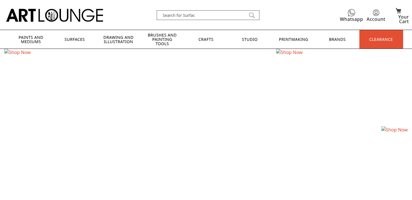
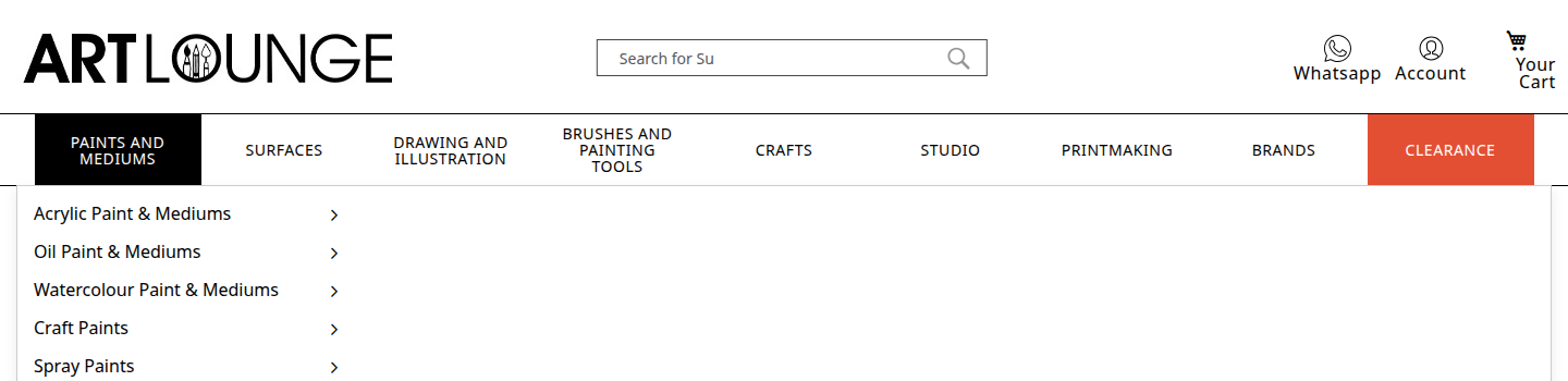
Desktop navigation
A clean, full-width horizontal menu bar with high-contrast hover states. Categories are clearly separated and labelled. Submenus open in a consistent, predictable position — no jumping or shifting.
65px nav height
Consistent height across all pages — doesn't shift or resize
Black hover state
High-contrast active colour — clearly signals the selected category
Fixed submenu position
Submenus always open from the same point — no unexpected jumps
Mobile navigation
The mobile menu slides in from the left — opening smoothly and closing just as cleanly. Subcategories expand and collapse with clear plus/minus indicators. The close tap zone on the right is deliberately large.
What was improved
- ✓Expand/collapse indicators use clean + and − symbols — no icon font dependency
- ✓Natural easing curve — opens and closes without feeling mechanical
- ✓Large close tap zone (54px) on the right — easy to dismiss without hunting
- ✓Styled scrollbar — matches the brand colours instead of the default system bar
Bugs fixed
- ✗Yellow underline on active category from the old theme
- ✗Phantom icon that appeared from inherited platform styles
- ✗Default system scrollbar clashing with the brand aesthetic
Brand browsing — A to Z
The brand index now has a full A-Z alphabet shortcut at the top, letting shoppers jump directly to brands by first letter. On desktop, brands appear in a flowing card grid. On mobile, the alphabet sits in a compact sidebar alongside a two-column brand grid — both accessible at once.
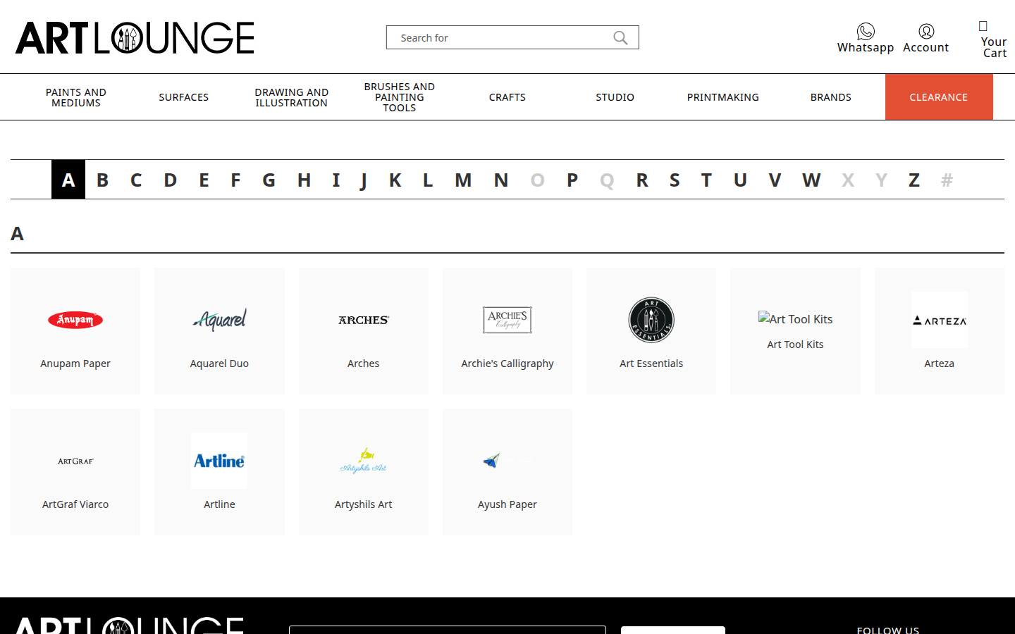
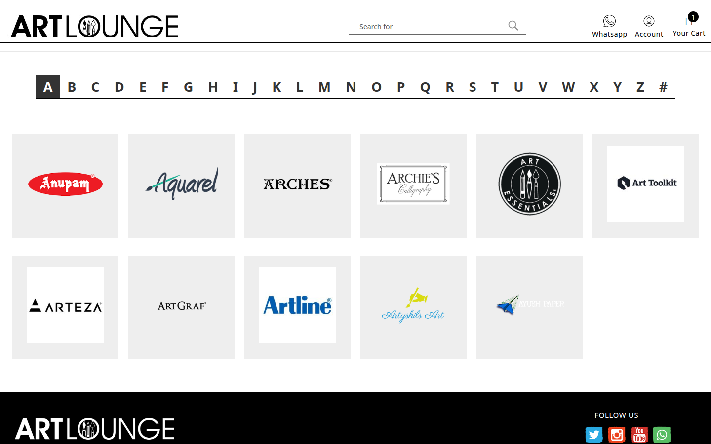
The A-Z bar replaced a separate breadcrumb trail — it does the same job in less space and is much faster to use.