01 — Business Impact
A storefront, rebuilt. Here's what changed — and why it matters.
Not a visual refresh. A structural overhaul that makes the store faster to browse, easier to run, and built so future changes don't break anything.
What got better
Three areas with a direct impact on the business
More people reach checkout. Fewer drop off from frustrating micro-moments.
Marketing moves without waiting. Campaigns go live when they need to.
Banner update workflow
Before
- 1. Email developer
- 2. Wait for availability
- 3. Edit backend code
- 4. Deploy + flush cache
- ~4 hours
After
- 1. Open admin panel
- 2. Upload image + link
- 3. Save. Done.
- ~2 minutes
Future changes are faster, cheaper, and lower risk. The mess is gone.
Stylesheet size
−78% — less CSS the browser has to parse before painting anything
The commercial loop
How design decisions translate into revenue
Nobody abandons a checkout in one dramatic moment. Sales leak away through small frustrations. Here's how each fix plugs a specific leak.
Large tap targets → Fewer abandoned actions
Every interactive element is at least 44×44px on mobile. When users tap what they intend to tap, the sale keeps moving. A mis-tap on 'filter reset' when you meant 'Add to Cart' ends visits.
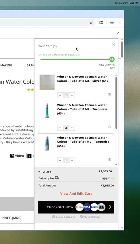
5-step cart feedback → Higher confidence to pay
Button changes state. Toast confirms the item. Cart slides open. Count updates. Checkout stays pinned. Each step removes doubt. Doubt is what causes people to leave before paying.
Delivery progress bar → Bigger average orders
Two milestones: free delivery at ₹999, free gift at ₹2,499. Shoppers near a threshold add one more item to unlock it. This is the most well-proven lever for increasing basket value without discounting.
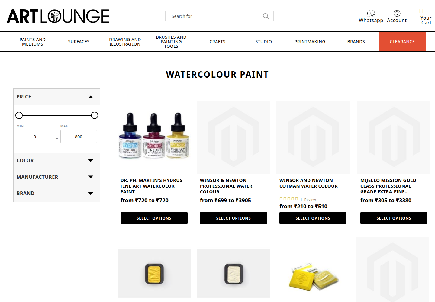
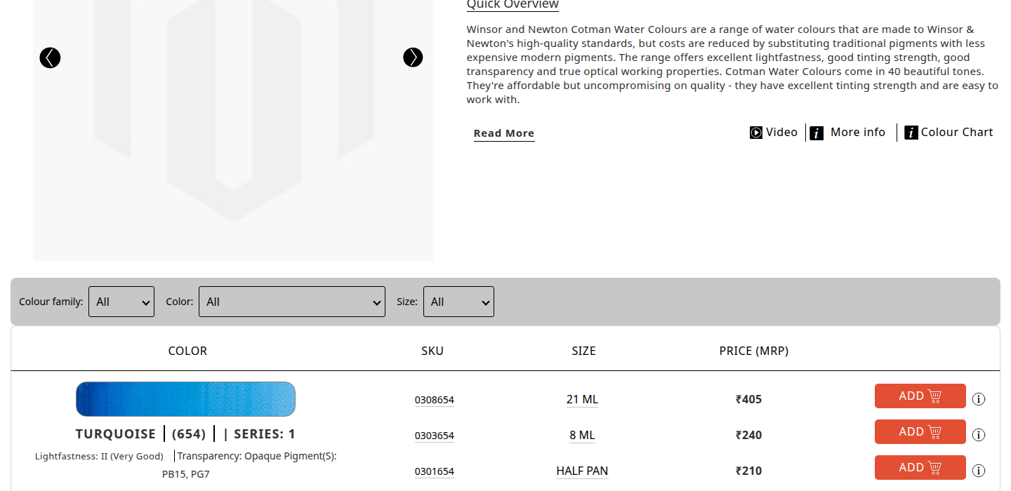
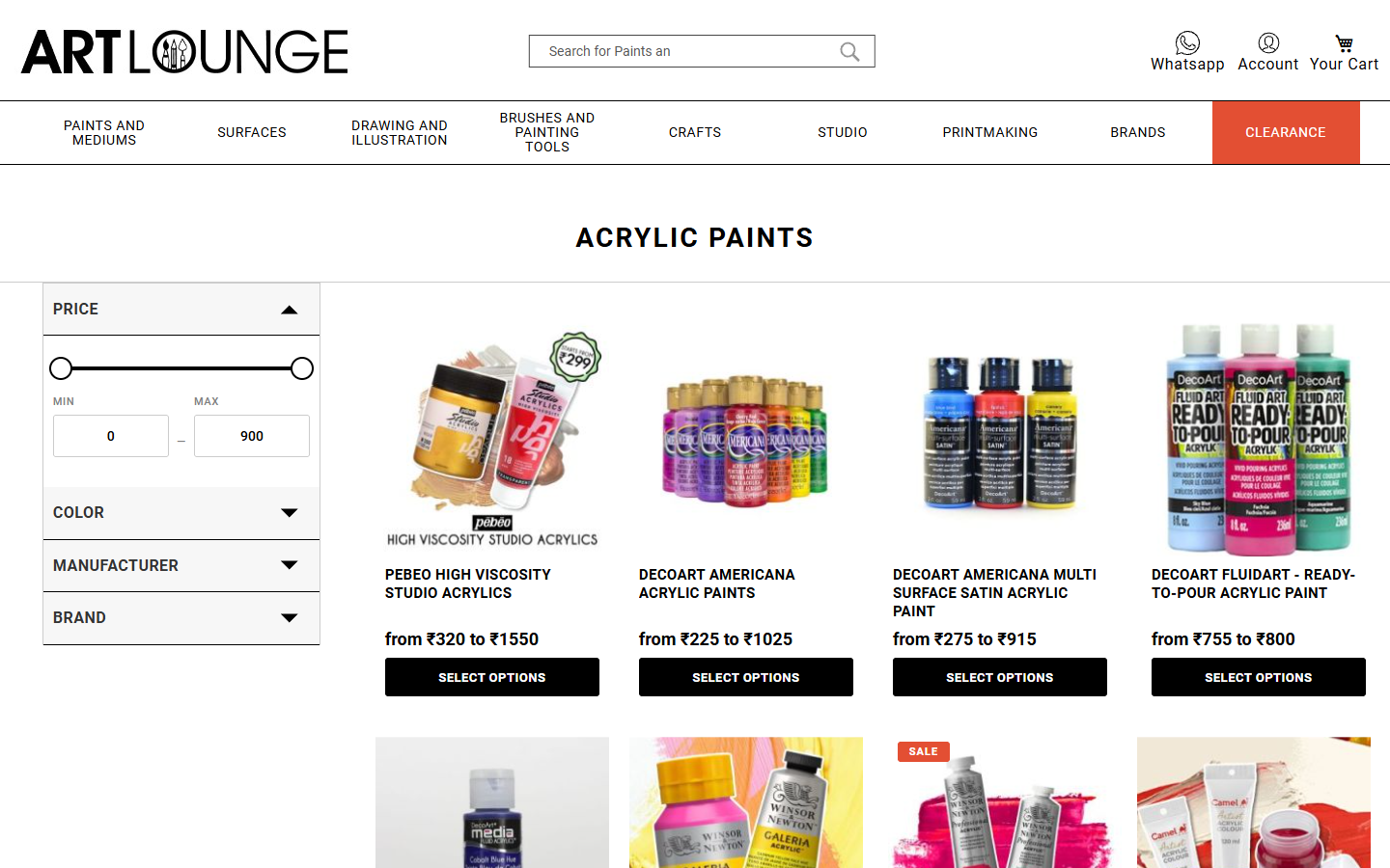
Readable variant tables → Decisions get made
Products with multiple colours, sizes, or finishes need comparison tables that actually work on a phone. Before: sideways scrolling, cramped columns, confusion. After: clean, adaptive, and easy to act on.
Browse →
Compare →
Choose →
Cart →