Storefront overhaul · Magento 2 · Art Lounge India
The Art Lounge shopping experience upgrade
Transforming a storefront from difficult to maintain and frustrating on mobile, to scalable and maintainable.
Kshitij Shah
Co-Founder · Art Lounge India
01 — The one change that explains everything
The brand now runs on shared rules, not page-by-page fixes
Change one rule and every page that uses it updates automatically. Try it.
A concrete example
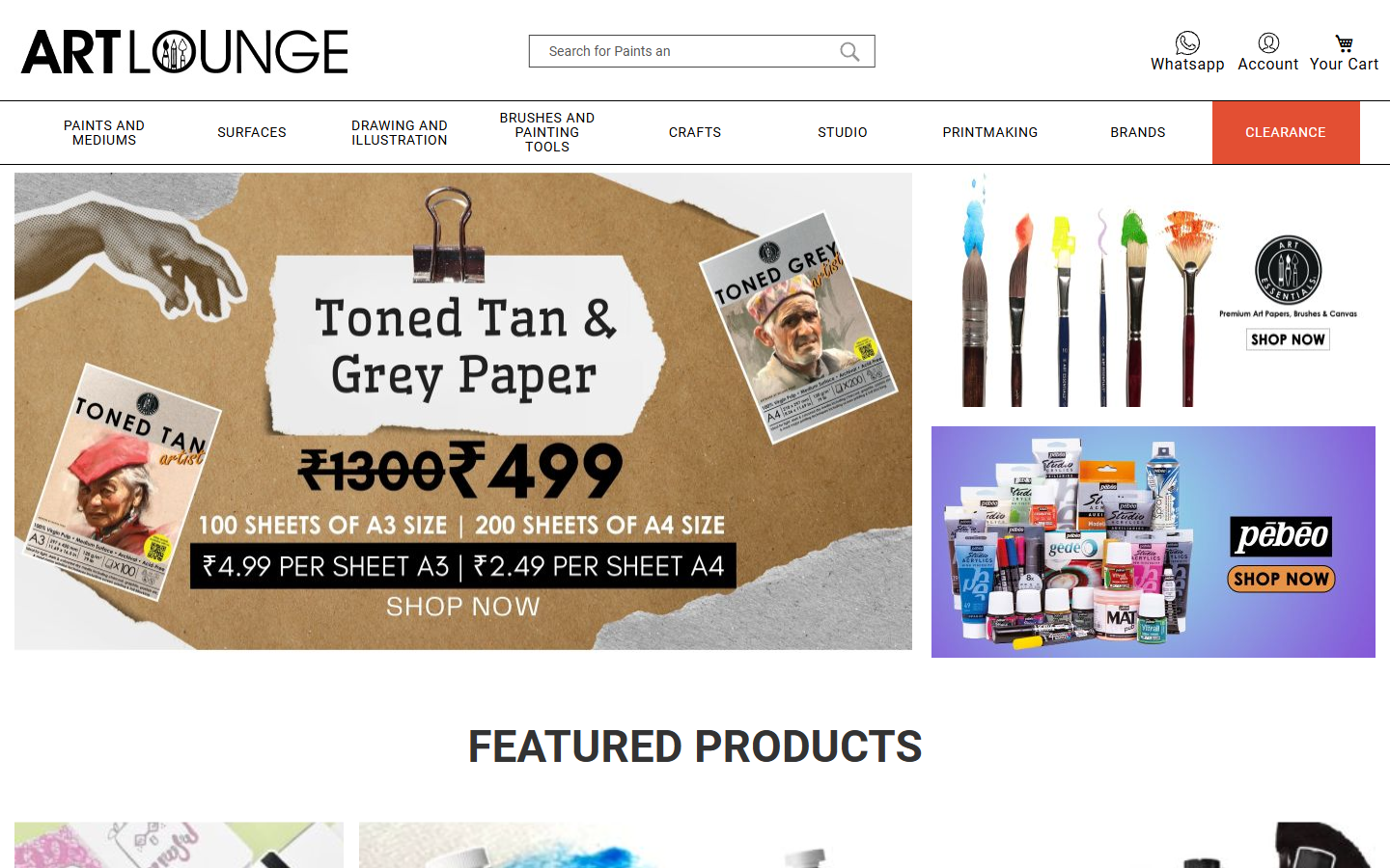
One rule controls every "Add to Cart" button on the site
Click the colour swatches below to see exactly what "change it once, update everywhere" means.
flows to every page that shows products
Homepage
Featured products section
Category pages
Product listing grid
Brand pages
Brand product view
Search results
Search product grid
Product detail
Main product page
5
page types
1
line changed
The same principle applies to every colour, font, spacing value, and component on the site — 401 rules in total.
02 — What it looks like now
A storefront that earns trust within seconds
The visual upgrade is immediate on desktop and mobile — cleaner layouts, consistent product cards, and fewer moments that make shoppers hesitate.

03 — The numbers
The four biggest shifts — measured
Time to ship a change, CSS per page load, mobile usability, and visual consistency — before and after.
2 min
was 4 hours
To update a homepage banner
-99%85 kb
was 380 kb
CSS downloaded per page load
-78%0
was 27
Mobile tables broken on phones
-100%CSS the browser downloads
Every page load, every visitor — 78% less weight to ship
Time to update a promo banner
What took the team 4 hours now takes 2 minutes
Inconsistent card layouts across the storefront
One shared design, applied everywhere products appear
Mobile product tables that broke on phones
27 product types that sent mobile shoppers away — now fixed
What these numbers mean day-to-day
Banners update in two minutes instead of two hours. The product card looks the same everywhere — no more visual inconsistencies that erode trust. And the stylesheet the browser downloads is 78% smaller, which means pages load faster for the 60%+ of shoppers browsing on mobile.
04 — Explore
Explore the work
Grouped by what changed — start with the Buying Journey for the full picture, or jump to the area that matters most.