02 — Buying Journey
The Complete Buying Journey
A step-by-step look at the shopping experience — and what was fixed at each stage to reduce drop-off.
6
stages of the journey, each improved
5
pieces of feedback after Add to Cart
44px+
minimum button size on mobile
0
visual jumps or shifts during loading
Sales don't disappear in one dramatic moment — they leak away in steps
A confusing filter, a button that's hard to tap, a cart with no feedback — each small friction point increases the chance a shopper gives up. This redesign removes those friction points at every stage.
6
stages of the shopper journey, each intentionally strengthened
This is what shoppers were dealing with on mobile
At Step 3 — Compare Options — the variant table used to overflow the screen. The Add button was half off-screen. Toggle to see what was fixed.
Before — broken on mobile
Columns overflow the screen. The Add button is half off-screen.
Winsor & Newton Artists' Oil Colour
Select your colour and size
| SKU | Colour | Size | Price | Qty | Add |
|---|---|---|---|---|---|
| WN-OIL-R5 | Cadmium Red | 5ml | ₹420 | − 1 + | Add |
| WN-OIL-B5 | Cerulean Blue | 5ml | ₹380 | − 1 + | Add |
| WN-OIL-S5 | Burnt Sienna | 5ml | ₹340 | − 1 + | Add |
| WN-OIL-W37 | Titanium White | 37ml | ₹620 | − 1 + | Add |
← Scroll right to see Add button
Table overflows at 375px. The Add to Cart button is cut off. Shoppers can't complete the action.
Six steps, all improved
Click any step to explore it — or let it play through automatically. Every screenshot is from the live production site.
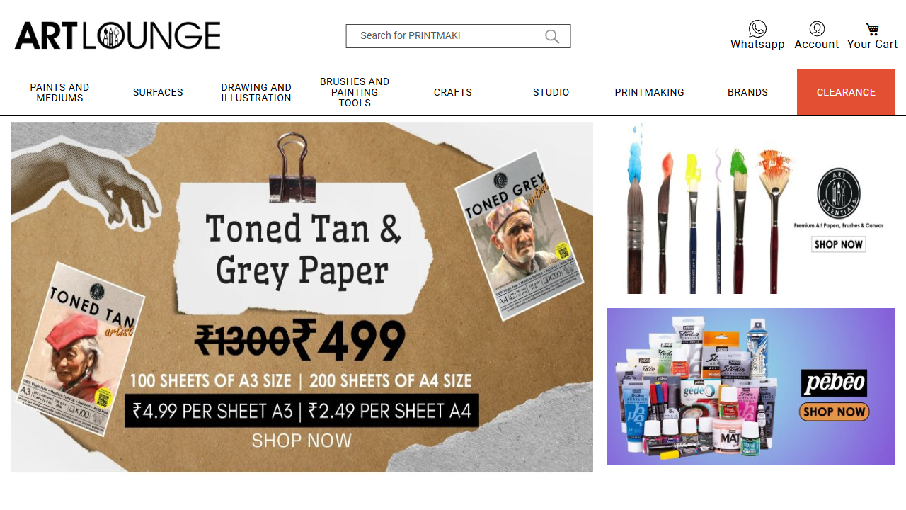
Arrive & Browse
The first few seconds set the tone. A clean banner, clear categories, and a well-spaced product grid tell the shopper they're in the right place.
- ✓Hero banner adapts cleanly to all screen sizes — no cropping or overflow
- ✓4-column product grid on desktop, 2-column on mobile — comfortable to scan
- ✓Every product card looks the same wherever it appears
- ✓Sale badges and pricing are clearly visible and consistent
Mobile actually works now
Over 60% of Art Lounge shoppers are on mobile. Before this project, the mobile experience was a known problem — tables that broke, buttons that were too small, filters that ate half the screen.
Every layout, button, filter, and checkout step was tested on small screens. If it didn't work at 375px, it wasn't done.
375px
Smallest screen tested
Works on budget Android phones
44px
Minimum button size
Accurate taps, no accidental misses
0
Layout shifts on load
Pages feel stable from first frame