07 — Browse & Filter
From Browsing to Buying, Without the Friction
Categories, brand pages, filters, and pagination now work together as one clear, consistent product-discovery journey.
3
clear browsing levels — each with a job
40+
brands easy to browse and discover
1
shared filter experience across all pages
40px
minimum filter button size — easy to tap
Most drop-offs happen before shoppers even see a product
If the path from the menu to the right product is confusing, slow, or inconsistent — people leave. These pages were fragmented. Now they work as one.
120px
vertical screen space saved on mobile by hiding filters until they're needed
Three levels — each with a clear job
Most shoppers arrive with a rough idea, not a specific product. The category structure takes them from broad to specific — each level narrows the options without losing them.
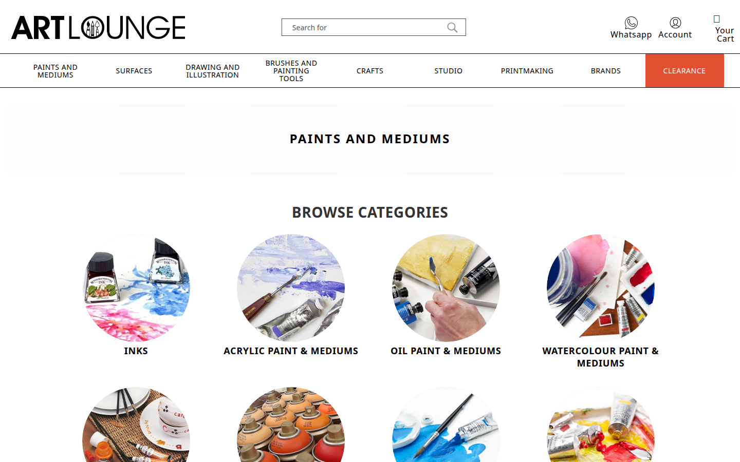
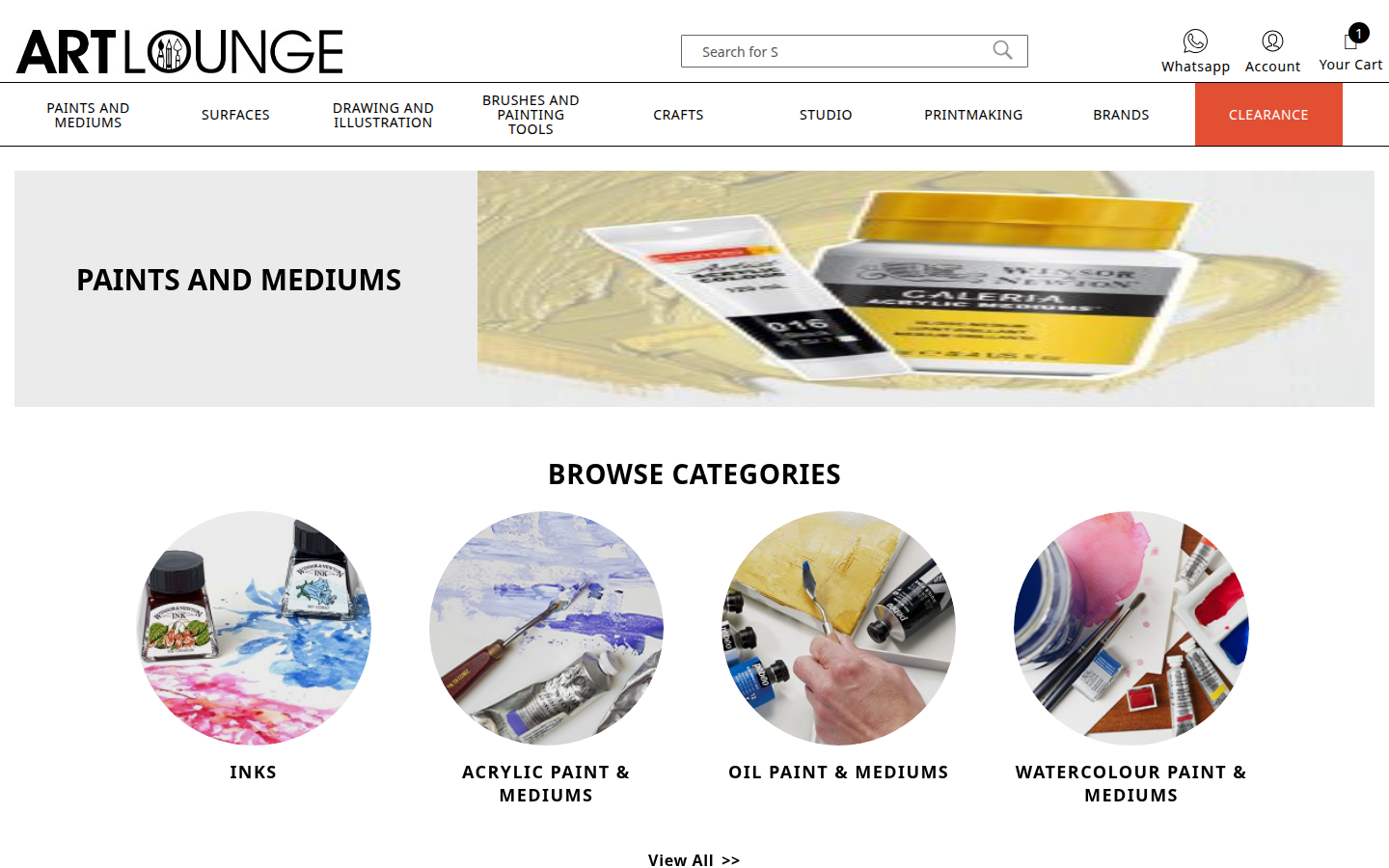
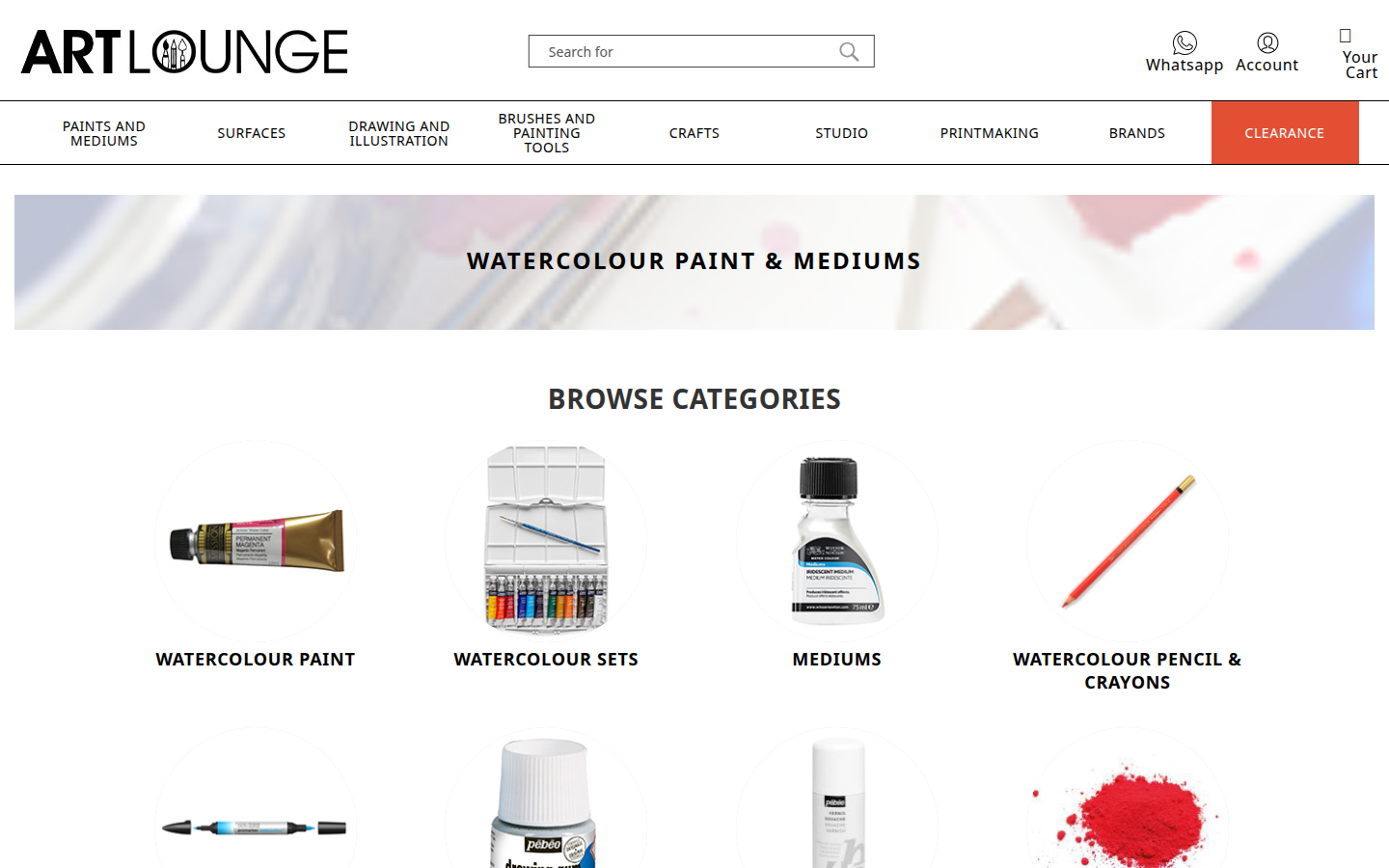
Level 1 — Main category entry
The shopper arrives from the main menu. They see a grid of subcategories as visual cards — each with an image. This is the first fork in the journey, and the layout makes the options immediately clear.
- ✓Visual subcategory cards with images
- ✓Cards resize smoothly for any screen
- ✓Hover effect gives a sense of interactivity
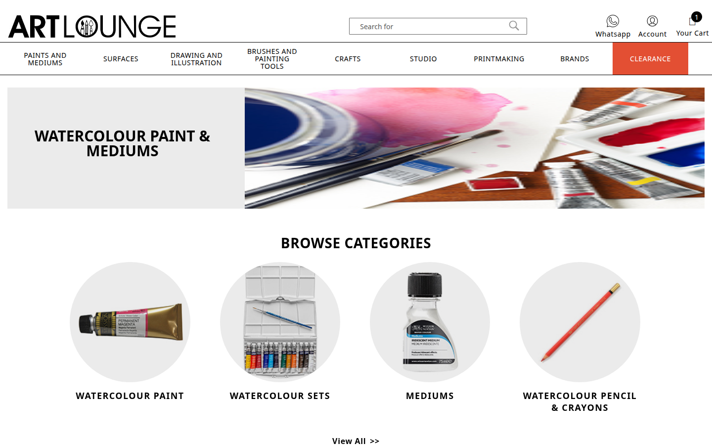
Level 2 — Subcategory
The shopper narrows down. For example: Paints & Mediums → Acrylic Paint, Mediums, Sets. More subcategory cards guide them toward the specific type of product they want before entering the product grid.
- ✓Subcategory image cards with clear labels
- ✓Breadcrumb shows where you are
- ✓Cards use the same shared design rules as the rest of the site
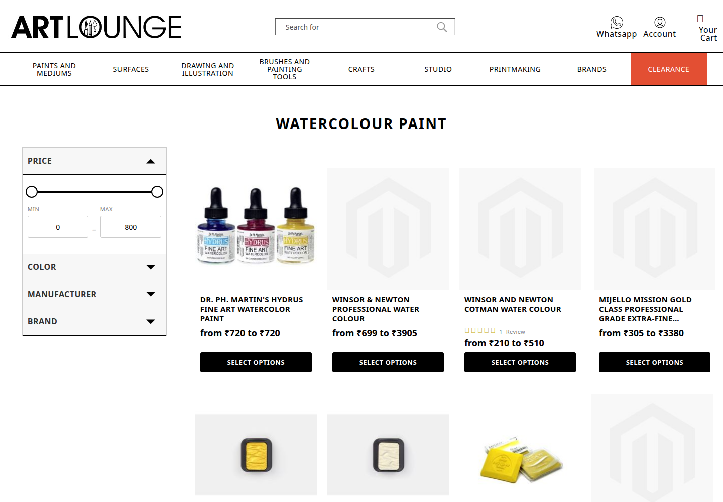
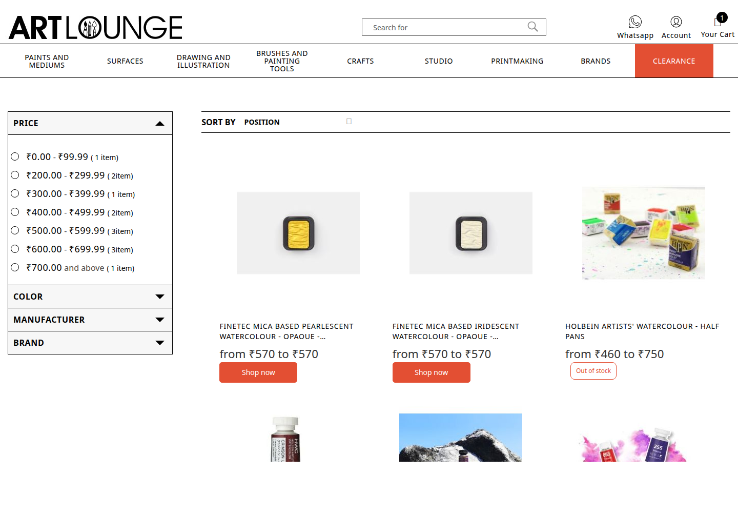
Level 3 — Product listing
The full product grid, with filters and sorting. This is the main shopping page where people start seriously browsing and comparing. Filters sit in a sidebar on desktop and slide out as a panel on mobile.
- ✓Sidebar filters on desktop — always visible and accessible
- ✓Slide-out filter drawer on mobile — keeps products front and centre
- ✓Shared pagination that works the same way everywhere
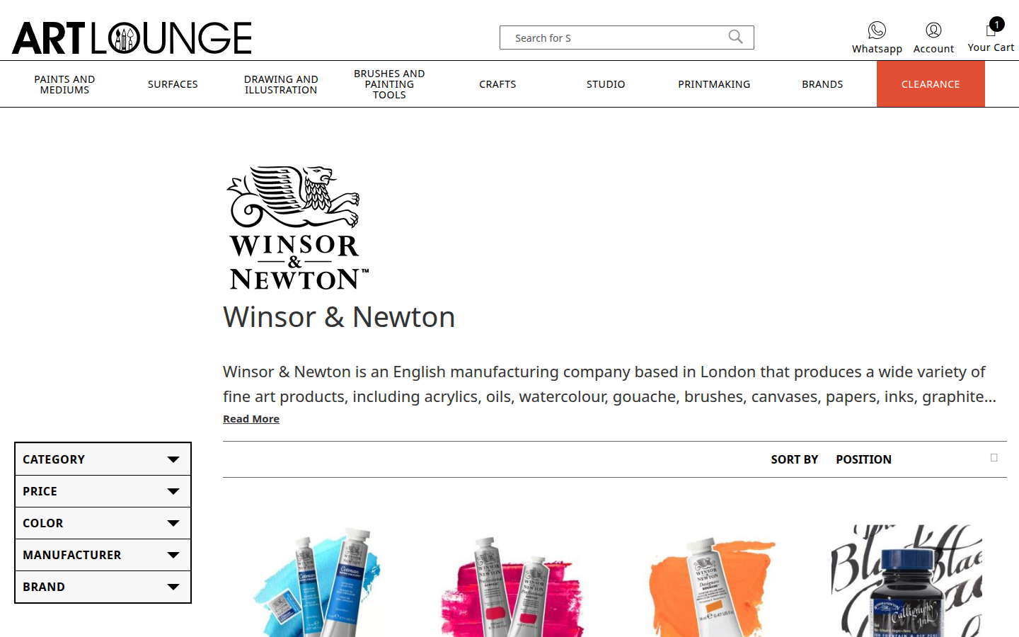
Brand pages
Shoppers who browse by brand get a dedicated index and individual brand pages — using the same filters and pagination as category pages, so nothing feels unfamiliar.
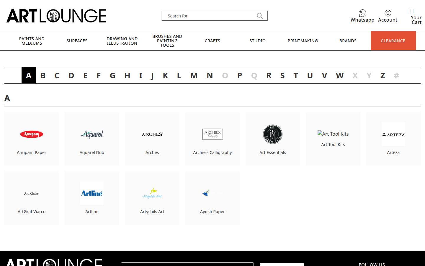
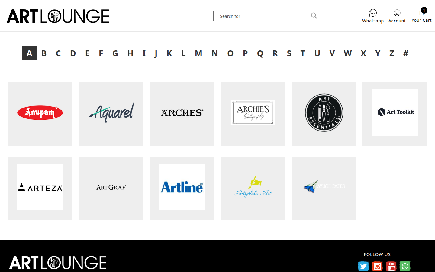
Brand index — A to Z
An alphabetical index of all brands, with a click-to-jump A-Z shortcut. On desktop, brand cards fill the grid. On mobile, the alphabet sits in a sidebar so both navigation and brands are visible at once.
The A-Z bar is the navigation. A separate breadcrumb was removed — it duplicated what the alphabet already does.
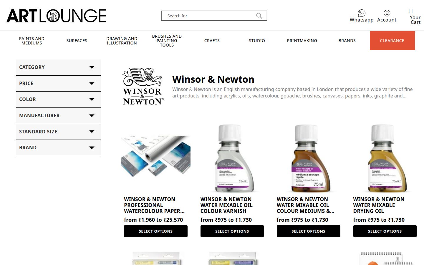
Brand product page
Each brand's product listing uses the same layout as a category page — shared filter panel, product grid, and pagination. Shoppers don't need to relearn the layout when they switch from category to brand browsing.
- ✓Brand header section at the top — shows brand identity
- ✓Filter panel on the left — same as category pages
- ✓Product grid — same unified card as everywhere else
- ✓Shared pagination — consistent navigation through results